Designing Accessible Color Systems with OKLCH: Practical Patterns for UI Teams
OKLCH is reshaping how UI teams build color systems by aligning sliders with human vision. Learn how to craft accessible palettes, theme at scale, and ship modern color tokens without headaches.
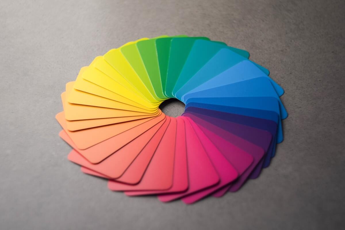
- OKLCH aligns with human perception, making color adjustments predictable across your UI.
- Build accessible palettes by anchoring lightness first, then tuning chroma and hue.
- Ship OKLCH tokens with progressive fallbacks to cover older browsers and wide-gamut displays.
Color work used to mean dragging imprecise sliders, chasing inconsistent contrast ratios, and fighting tints that looked perfect in one component but muddy in another. The OKLCH color space changes that. By structuring color around what humans actually perceive—lightness (L), colorfulness (C), and hue (H)—it makes design decisions more predictable, more accessible, and easier to scale across complex design systems. If you’ve ever struggled to keep a brand palette consistent in both light and dark mode, or if your team ships in both sRGB and wide‑gamut displays (like P3 on modern phones), OKLCH will feel like a breath of fresh, color‑accurate air.
This guide focuses on practical patterns: why OKLCH is trending in design systems, how to build an accessible palette step by step, and how to ship tokens that work in Figma, code, and QA. You’ll find concrete examples, a compact comparison table, and an FAQ that tackles the typical adoption questions UI teams face.
What makes OKLCH different (and useful)?
Designers have long relied on RGB and HSL/HSV sliders because they are everywhere, not because they’re good representations of how we see color. In those legacy spaces, equal numerical changes don’t translate to equal visual changes. That makes small adjustments risky: a tiny tweak in saturation might unexpectedly affect perceived brightness, turning a crisp button into a flattened blob. OKLCH (derived from the OKLab model) is designed to be perceptually uniform. When you increase L, the color gets lighter in a way that matches human perception. When you increase C, the color gets more vivid without changing its perceived brightness. That single property makes OKLCH especially powerful for UI work: you can iterate fast without breaking contrast or balance.
There’s also a practical, production‑ready advantage: OKLCH plays nicely with modern CSS. You can declare colors directly in CSS using oklch(), and pair them with feature queries and fallbacks. Combined with design tokens and variable fonts, designers can now treat color as a system that scales across product surfaces, domains, and modes.
| Color Space | Uniformity | Gamut Awareness | Adjustability | Current CSS Support | Best For |
|---|---|---|---|---|---|
| RGB/HEX | Low | sRGB only | Numeric, not perceptual | Universal | Legacy palettes, quick hacks |
| HSL/HSV | Medium‑Low | sRGB only | Hue/sat/light sliders | Universal | Simple color pickers |
| LCH | Higher | Wide gamut capable | Perceptual-ish | Modern browsers | Editorial, brand tints |
| OKLCH | High | Wide gamut capable | Lightness/Chroma/Hue match perception | Chromium & Safari widely; verify Firefox | Design systems, accessibility, theming |
Uniformity isn’t about academic purity—it’s about fewer regressions. In OKLCH, your “brand‑500” color can retain consistent brightness while you dial up vibrancy, meaning a badge can go from subtle to attention‑grabbing without breaking contrast on different backgrounds. That predictability compounds when you scale to hundreds of tokens and multiple themes.
Another pragmatic advantage is how OKLCH handles wide‑gamut displays. As more users encounter P3 or even Rec.2020 device gamuts, sRGB‑only palettes can look dull by comparison. With OKLCH you can safely define wide‑gamut colors and still compute predictable fallbacks to sRGB for older devices or browsers, maintaining intent and accessibility.

Building an accessible palette step by step
Every durable palette starts with text and surfaces. If your body text and backgrounds are inconsistent or barely meet contrast, everything layered on top—buttons, chips, charts—will inherit fragility. In OKLCH, the simplest mental model is to anchor lightness first, then season with chroma and hue.
- Anchor your neutrals with L first. Choose a family of surface lightness anchors (for example, L: 98 for canvas, 96 for elevated card, 92 for subdued surface) and set your base text anchors (for example, L: 20 for default text, 40 for secondary text). By keeping chroma near zero for neutrals, you get clean grays without hue drift in light and dark modes.
- Pick brand hue once; then vary chroma by role. Select a single hue angle (H) per brand family (e.g., primary at H: 250°, success at H: 145°, warning at H: 70°, danger at H: 25°). From there, dial chroma (C) up for accents and down for subtle UI states. Keep L aligned with the intended role—high L for backgrounds, mid for fills, lower L for text on light surfaces.
- Target contrast with L, preserve feel with C. Use L to hit your contrast targets first (e.g., 4.5:1 for normal text, 3:1 for large text and UI icons). Then adjust C to reach the desired brand intensity without throwing off legibility.
- Design both modes in parallel. Instead of inverting colors or guessing dark mode after the fact, build light and dark arrays in the same session. Keep relationships consistent: if
primary-600on light mode is a strong fill against L: 96, its dark‑mode partner should provide a parallel contrast ratio against dark surfaces, not just a hue‑inverted value. - Proof palettes on real components, not just swatches. Test links, disabled states, error banners, focus rings, and data viz. If an alert reads well in a card but fails in a toast at 90% transparency, adjust now before tokens spread to multiple codebases.
Here’s a compact example of role‑based tokens in OKLCH notation. Values are illustrative—use a contrast checker that understands modern color spaces and verify final ratios in sRGB output.
| Token | OKLCH | Intended Role | Notes |
|---|---|---|---|
| --color-bg-canvas | oklch(0.98 0.00 0) | App background (light) | Nearly white, neutral |
| --color-fg-default | oklch(0.22 0.00 0) | Primary text (light) | Comfortable body copy contrast |
| --color-brand-500 | oklch(0.65 0.15 250) | Primary interactive fill | Vivid but not electric on sRGB |
| --color-brand-700 | oklch(0.55 0.16 250) | Pressed/hover | Lower L for depth |
| --color-success-500 | oklch(0.75 0.12 145) | Positive state | Green with balanced lightness |
| --color-danger-500 | oklch(0.64 0.16 25) | Error action | Warm red tuned for legibility |
| --color-focus-ring | oklch(0.78 0.12 260) | Focus outline | High L, clear halo on light surfaces |
Notice how roles are primarily distinguished by L, while brand personality lives in C and H. This lets you achieve consistent accessibility across contexts without producing a lifeless monochrome interface.
For dark mode, mirror the logic rather than inverting hex values. Keep text near L: 0.90–0.94 for legible light text on dark surfaces, with surfaces in the L: 0.07–0.14 range. If your brand color needs to sit behind white text in dark mode, don’t simply drop L—reduce C a touch to avoid neon bloom on OLED screens, then tune L until your text meets or exceeds contrast targets.
When mapping these values to component states, try a lightweight scale convention per family (e.g., 50–950) but avoid over‑producing identical swatches. In OKLCH, you need fewer steps because each step is purposeful: a distinct change in perceived lightness or vividness that communicates hierarchy.
Implementation: tokens, theming, and handoff
Shipping OKLCH is straightforward when you design for progressive enhancement. Modern Chromium and Safari engines support oklch() natively; other environments can rely on fallbacks or a build step.
- Design tokens first: Define source tokens in OKLCH with semantic names (e.g.,
color.bg.canvas,color.fg.muted,color.intent.warning.fill). Keep brand‑agnostic roles separate from brand accents. - Modes as aliases: In your token system or Figma Variables, alias semantic roles to mode‑specific values (light/dark/high‑contrast). Avoid duplicating semantic names per mode; alias instead.
- CSS custom properties: Export tokens to CSS variables. Provide both a modern and a safe fallback.
Here’s a practical CSS pattern that uses fallbacks without complicating the codebase:
:root {
  /* sRGB fallbacks (approximate) */
  --color-bg-canvas: #f9fafb;
  --color-fg-default: #2a2a2a;
  --color-brand-500: #5a63d8;

  /* Progressive enhancement with OKLCH */
  @supports (color: oklch(50% 0.1 200)) {
    --color-bg-canvas: oklch(0.98 0 0);
    --color-fg-default: oklch(0.22 0 0);
    --color-brand-500: oklch(0.65 0.15 250);
  }
}

.button-primary {
  color: white;
  background: var(--color-brand-500);
}

body { background: var(--color-bg-canvas); color: var(--color-fg-default); }
If you need to compress palette width for older browsers, a build step can transform OKLCH tokens to HEX while retaining OKLCH in a separate file for modern clients. Many teams maintain “source of truth” tokens in OKLCH and generate platform‑specific artifacts (Android, iOS, Web) through a tool like Style Dictionary or Theo.
In Figma, store OKLCH values in Variables using numeric fields (L, C, H) or straightforward strings (e.g., oklch(0.65 0.15 250)). Plugins such as “OKLCH Color Picker” or “Gamut Map” help visualize out‑of‑gamut warnings and tweak lightness without losing the hue. For QA, attach contrast annotations to components directly in Figma—engineers will love having target ratios in the specs.
For theming across brands, you can keep shared roles consistent (text, surfaces, borders, focus) and swap only the chroma and hue for accent families. Because L controls perceived brightness, switching H and C for a new brand won’t blow up your contrast math. This modularity is one of OKLCH’s superpowers for multi‑brand platforms.
When it comes to shadow and elevation, OKLCH still helps. Shadows that look too dense often have more to do with lightness offsets than blur radii. If your elevated card feels heavy, slightly raise the surface L and reduce the shadow’s chroma (keep it near neutral), then tune opacity—this usually reads as “lighter” without losing depth.
For data visualization, OKLCH scales gracefully: align series by equal L and step C to delineate categories cleanly. Because equal steps in C feel like equal increases in vividness, legends become easier to parse and color‑blind safe sets are easier to assemble. Combine this with texture or line style for redundant coding.
Finally, be mindful of dynamic system settings. If your platform offers High Contrast Mode or prefers‑color‑scheme in CSS, create mode‑specific aliases that increase L separation of surfaces and borders, and slightly reduce C for overstimulating hues. The goal is to preserve meaning under different visual needs, not to slavishly mirror brand vibrancy.
No. Migrate incrementally. Start with semantic roles that cause the most bugs—text, backgrounds, interactive fills—and keep legacy hex values as fallbacks. Over time, unify the palette with OKLCH as your source of truth, then auto‑generate hex for older targets.
No. Migrate incrementally. Start with semantic roles that cause the most bugs—text, backgrounds, interactive fills—and keep legacy hex values as fallbacks. Over time, unify the palette with OKLCH as your source of truth, then auto‑generate hex for older targets.
Contrast is still computed on display‑referred color (commonly sRGB). OKLCH helps you aim by separating lightness from colorfulness, but you should verify final contrast with your target output space. Use a checker that supports modern color syntax and test both light and dark contexts with real component backgrounds.
Contrast is still computed on display‑referred color (commonly sRGB). OKLCH helps you aim by separating lightness from colorfulness, but you should verify final contrast with your target output space. Use a checker that supports modern color syntax and test both light and dark contexts with real component backgrounds.
Modern Chromium and Safari versions have strong support. Other engines continue to evolve. Use @supports (color: oklch(...)) to progressively enhance, and provide sRGB fallbacks or a build step that converts OKLCH tokens to legacy formats. Check current support on caniuse before shipping.
Modern Chromium and Safari versions have strong support. Other engines continue to evolve. Use @supports (color: oklch(...)) to progressively enhance, and provide sRGB fallbacks or a build step that converts OKLCH tokens to legacy formats. Check current support on caniuse before shipping.
On OLED and P3 displays, high‑chroma colors can bloom. Drop C slightly and raise L a touch for backgrounds behind white text. Verify on physical devices in both light and dark modes. Consider clamping to sRGB for specific components where consistency matters more than gamut richness.
On OLED and P3 displays, high‑chroma colors can bloom. Drop C slightly and raise L a touch for backgrounds behind white text. Verify on physical devices in both light and dark modes. Consider clamping to sRGB for specific components where consistency matters more than gamut richness.
If your product has multiple themes, strict accessibility needs, or a complex design system, yes—OKLCH will reduce rework. Start with new features and critical roles. For small, static palettes, HSL may be sufficient, but OKLCH still simplifies maintenance.
If your product has multiple themes, strict accessibility needs, or a complex design system, yes—OKLCH will reduce rework. Start with new features and critical roles. For small, static palettes, HSL may be sufficient, but OKLCH still simplifies maintenance.
Adopting OKLCH isn’t about chasing novelty; it’s about reducing design debt. By giving you orthogonal control over lightness, chroma, and hue, it turns palette building into a repeatable craft. Anchor with L to hit contrast, sculpt with C and H to retain brand character, then ship tokens with graceful fallbacks. Your team will spend less time patching color regressions and more time improving the product experience.